Over the past year, Trello’s design team has been working on an updated design system. Our goals for this tasty new design system are to create consistency, alignment, and efficiency across Trello.
My design teammate, Marc, recently wrote about the process and our learnings building the tool, which you can read here. A major part of our design system is typography, a design component that became a journey in itself. Without the right typeface, you could be sighing, squinting, or even squabbling over your team’s Trello boards.
If the story behind the screen intrigues you, grab a cup of Joe, sit back, and enjoy this true tale of type and teamwork at Trello.
Why Typography Matters
Whether on social media, a website, or a digital book, we are reading a lot of text on screens these days. And the countless types of screens we switch between affect the reading experience. These screens can be large or small, range from high to low resolution, have varying colour quality, and different levels of brightness.
The text on these screens is also affected by your surroundings. Have you ever tried to relax pool side to read a book on your phone or tablet? It most likely didn’t go well. Maybe the screen was not bright enough or there was a big sunshine-y glare preventing you from reading the content.
Distance from the screen matters too. Small mobile screens are usually closer to you, while laptop or tablet screens are a little further away. Larger screens like the desktop computer or monitor at your workstation will be even further away. We take all these factors into account when setting type for Trello. We are also cognizant to design and set our type for Trello so that it’s accessible for all of our users.
Before I go further, here’s a little crash course on Typography that may be helpful for understanding some terms in this post:
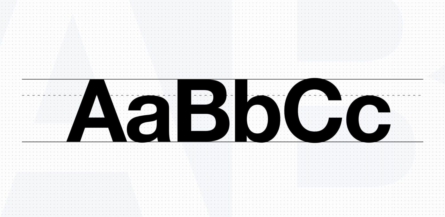
- Typeface: This term is the combination of the type settings such as size and line heights, whereas the term Font refers to the actual file type of the typeface. (Helvetica is a typeface and Helvetica.tff is the font.)
- Legibility: Legibility is the ease with which a reader can recognize individual characters in text. Aspects of type design that affect legibility include x-height, character shapes, stroke contrast, the size of its counters, serifs or lack thereof, and weight.
- Readability: Just because something is legible doesn’t mean it’s readable. Legibility is the equivalent of saying tree bark is delicious because it’s edible. As Jason Santa Maria notes: “In terms of readability, we’re aiming higher. Readability combines the emotional impact of a design (or lack thereof) with the amount of effort it presumably takes to read.”
Great! Now that we’re closer to being typography pros, here’s why these different terms matter: Typography can improve or break the reading experience, which translates to a good or bad user experience. If the text is hard to read, it won’t be legible and therefore won’t be something users will want to read. This results in a bad user experience because users will get frustrated and quit the app.
However, if the typography is invisible—in the sense that your entire focus is on the content which is easily scannable and readable—you will be able to read faster and enjoy the content which will result in a better user experience.
Our Design Goals At Trello
Trello is an application that consists of short- and long-form text. Depending on the task you want to perform in Trello, you may encounter varying lengths of content. This presented a difficult challenge to pick a new typeface for Trello. Not only did we want to pick a typeface that would work well in varying contexts within Trello, but it should also communicate the voice, personality, and tone of Trello.
Overall, the primary goal was to improve personality, legibility, and readability. The typeface we were using at the time was Helvetica Neue. Helvetica is very common, so much so that it feels like it’s everywhere (there is even a really good documentary on this typeface). The book On Web Typography by Jason Santa Maria discusses the prevalent use of Helvetica on the web:
“Helvetica can be unsuitable for long stretches of text because the letterforms appear too uniform, reducing legibility. Like most things in design, it’s about finding the right balance.”
As a design team, we were in search of that balance.
How We Picked A Typeface
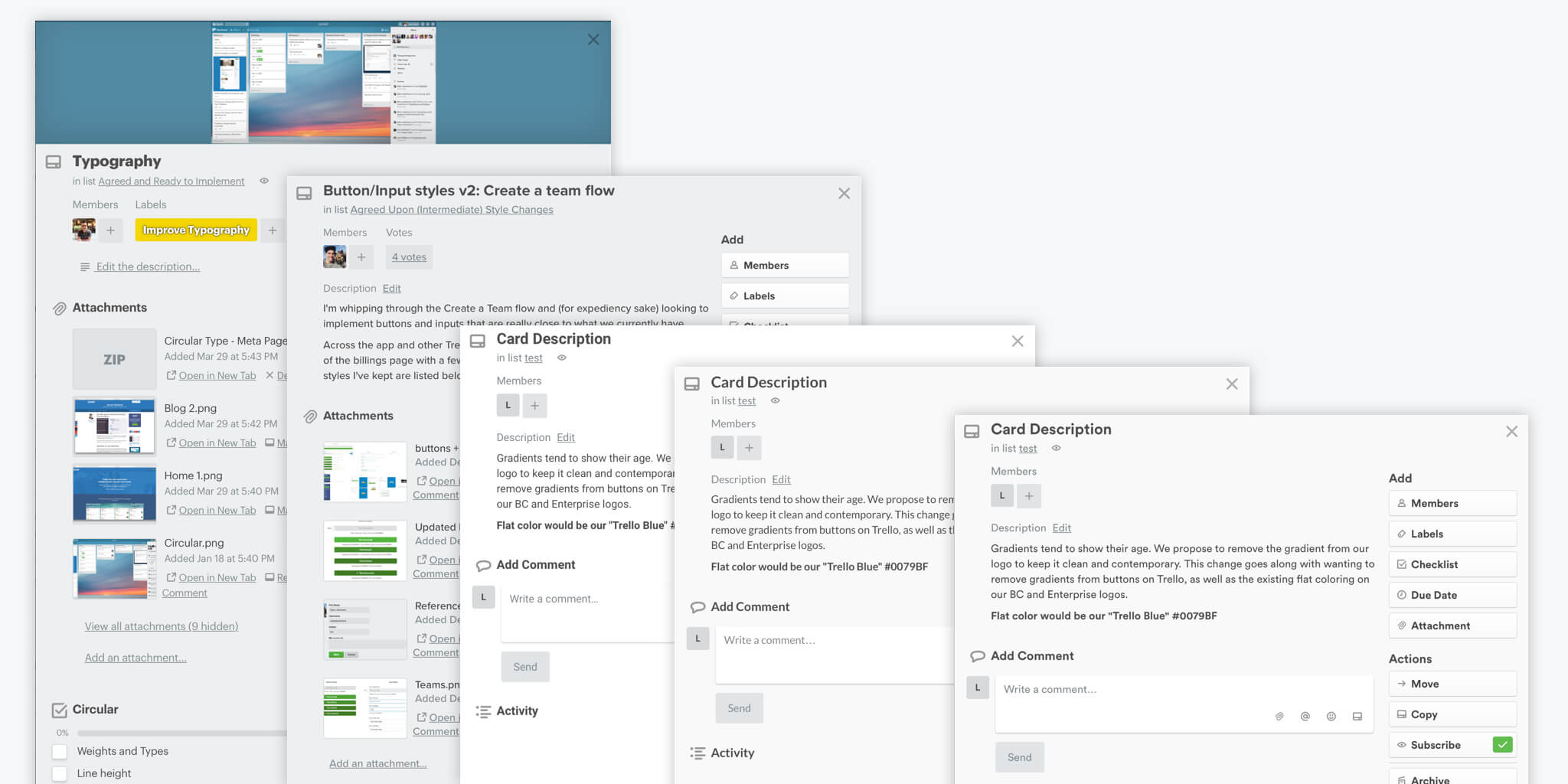
The engineering team at Trello has internal tools that let us manipulate the production version of Trello to try new features and design changes. For our typography exploration, we researched and compiled a set of typefaces that we thought would work well, and we began testing with gusto.
Like software versioning, we had several Trello versions for all the typefaces we were testing. As a design team, we were able to get a true sense of how each typeface affected the experience on Trello. We could dive in and out of each version to view the legibility and readability of each typeface. Working with actual content can be far more effective than visualizing a typeface in a design tool. For us, this proved to be the case.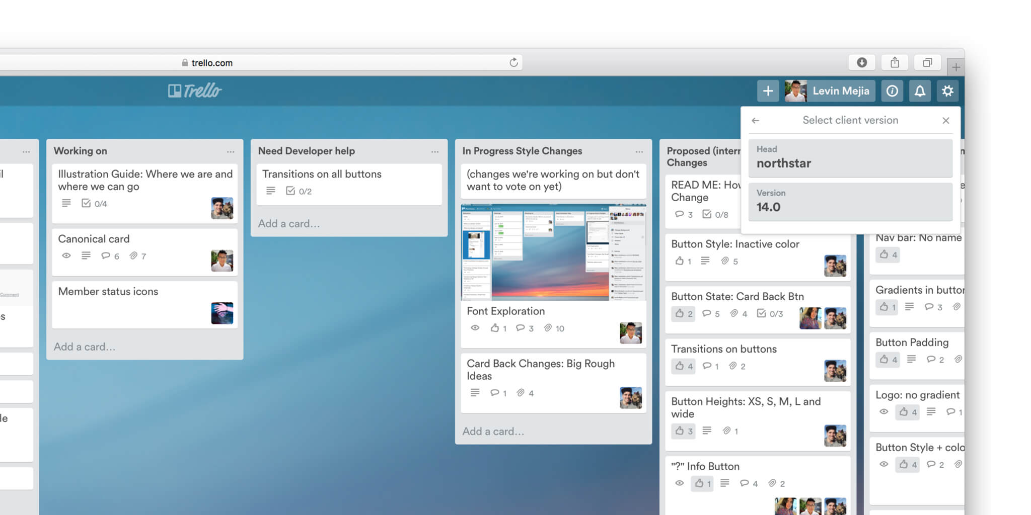
Testing typeface in-app made it easy to quickly rule out some options. Too thin or too thick, some typefaces did not reflect Trello’s personality, made text harder to read, or had other nuances that just didn’t work.
For typefaces we wanted to validate individually before sharing with the team and creating a new internal version of Trello to test, we used tools like Font Swap, a handy Google Chrome Extension.
Our approach led us to a clear winner. The typeface met all of our criteria: it had the right voice, personality, and tone. It improved legibility and readability. It looked great on marketing materials. It even looked good on Trello mobile apps, even though that was not part of or current goal in determining the typeface we wanted to use.
With a typeface selected, the design team began improving its readability and legibility for Trello views. We tweaked font sizes, line heights, letter spacing, and other Trello design elements, like buttons, to get it just right.
Let The Testing Begin
Ready to receive our team’s feedback, we shared it internally with the team. At Trello we believe in “dogfooding” every new change we propose to make the product. In our case, we wanted to know for sure that the new typeface made Trello more legible and readable resulting in a better and more delightful user experience by putting it in front of our toughest critics, our fellow co-workers.
The team could also access the versioning system we were using which meant that they started using the new typefaces in their day-to-day use.
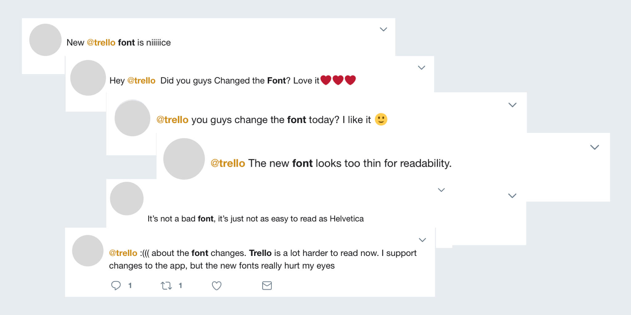
The immediate feedback was mixed; some people loved it, and some thought it made Trello harder to read. We tried to understand what elements of the typeface were causing this and tried to resolve them with further typeface tweaks.
Over time, the feedback became more positive. It’s possible that, once the shock of such a big change wore off, people began to forget how Helvetica made Trello look and started to appreciate the effort behind the new typeface. After a couple of weeks of using the new typeface, people went back to using Helvetica, to see if it was better. The result? They would immediately switch back to the new typeface!
We had validated the design team’s goals, and were ready to test the new typeface publicly.
We decided to A/B test the typeface for six weeks to get direct feedback from our users. We included a survey to collect feedback and also monitored NPS scores, MUA, and social media for raw reactions.
Addressing Concerns
Following up on the survey feedback, we did our due diligence to address the concerns brought forward. We started by looking at how Trello’s performance was affected by using a custom font.
Computers come installed with set fonts, so if the font being used on the website is not installed on your computer, we would need you, the user, to download the font. As you can imagine, that affects load times because fonts can be large files. The font we planned to use needed to support multiple languages, which added to the font size. While we ran tests to understand how the font was affecting performance, those test were inconclusive. We determined that our method of loading the font to the user would not be dramatic enough to prevent us from shipping the new font.
The survey feedback included comments such as: “This font sucks!!!“, and “I can’t read Trello anymore.” We investigated these concerns and found out that the typeface readability and legibility was being affected by low solutions monitors and font rendering on different operating systems. As stated above, we thought we could resolve this issue by serving up good ol’ Helvetica instead of the new typeface.
There were issues with language and character support, but it turns out that was an easy fix because we could purchase the font that included all the necessary characters.
As a design team, we believed that we had addressed and resolved the concerns from our test. Ultimately, we thought that the new typeface choice would help evolve Trello’s design language and user experience. Furthermore, when we looked at all the data, we still felt confident in the typeface. Design is subjective, we thought, and we wouldn’t get perfect data to validate a design decision.
But Wait…
Before going any further, we took a step back as a company and starting asking some really hard questions: Are the inclusive data and survey results trying to tell us something? Do we need to do more even more research?
We set a higher bar for ourselves and began a new round of research that led us to getting answers from Atlassian and from other big companies who had worked with the typeface. We learned that, in some cases, the typeface was heavily edited, formatted, and optimized for different scenarios and screen types.
Evolving the typeface to make it just right for Trello was something we were not prepared to do. Learning from other companies and their implementation methods helped us reach a conclusion.
Moving Forward
As a team, we decided not to ship the new typeface. It’s just as, if not more, important to say “no” as it is to say “yes” to product changes. It’s especially hard to say no to something that has been in the works for close to a year.
However, it was the right decision and best thing for Trello—for now at least. There are a lot of advancements being made in typography for the web right now, one of them being system fonts. Maybe these typefaces will or will not work for Trello. We will continue to do our research and learn from our community.
What Can We Learn?
Typography is a key building block to making a great product because it’s something your users will interact with every single time they use your product, so it’s not a choice to be taken lightly.
Indeed, it can even be difficult, but it should not discourage you from embracing how it can improve and bring delight to your product. Understanding and researching your product goals will help determine which typeface is best for your product.
For us, it was not until the later parts of our journey that we decided to say no to a product change. We felt we had validated our goals and addressed the major concerns to green light the product change, but it was still the right time to take a step back and come together as a team to ask the hard questions in the interest of the Trello user experience.
The goal of our design system was to create consistency, alignment, and efficiency across Trello. Even though we did not ship a new typeface, we accomplished the design system project goals, learned a lot, and grew as a team.